The Ultimate Protest Sign Guide: Diy 'No Kings' Poster Ideas and Crafting Tips
 By Elena Rostova
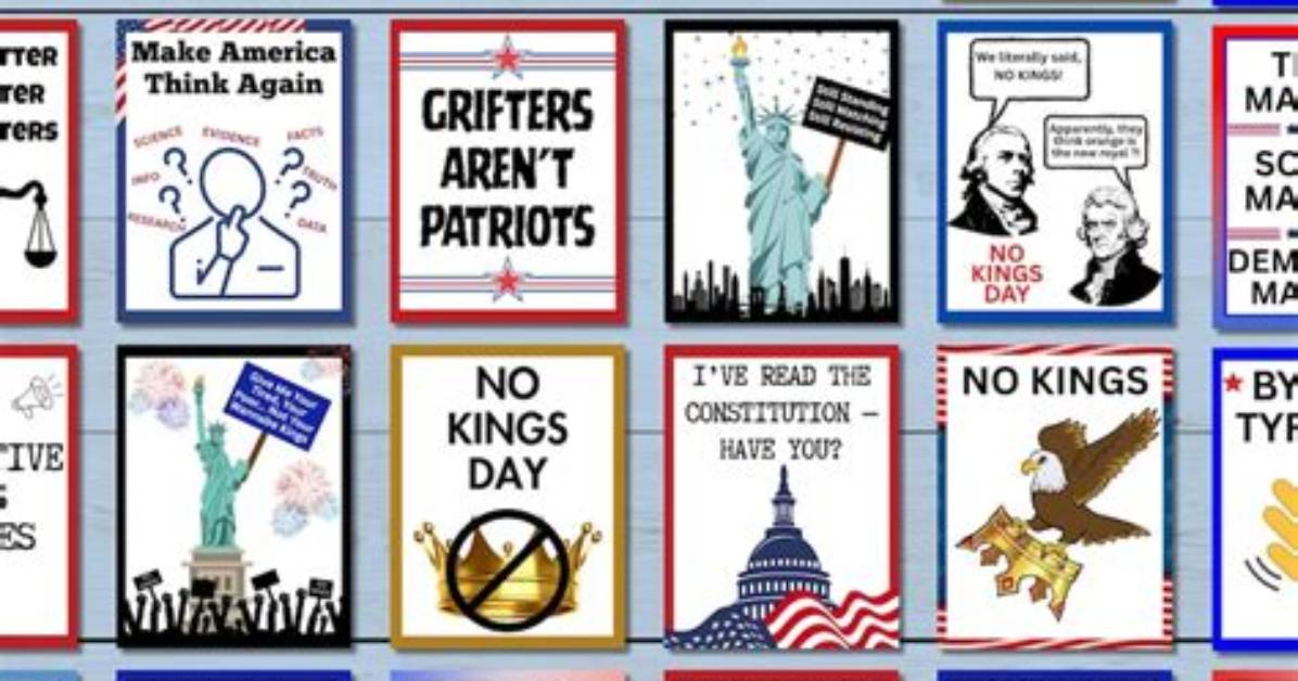
Crowds create intense visual noise. Between multi-colored flags, high-visibility safety vests, and camera flashes, thin or ornate text disappears immediately. Effective high-contrast lettering design relies on strict principles of legibility engineered for distance.
Standard serif fonts and flowing script look elegant up close, but their variable stroke weights make them illegible at 30 feet. Hand-drawn block letters modeled after bold grotesque fonts, such as Impact, Futura Bold, or Helvetica Black, maximize visual weight. The stroke width of each letter should equal roughly one-fifth of the letter's total height. For a letter four inches tall, the line thickness should be nearly an inch wide.
Contrast is equally decisive. Black lettering on a bright safety-yellow or pure white background yields the highest optical readability under overcast skies and artificial street lighting. While red text appears aggressive, it actually loses contrast in photographs and shifts toward dark gray in low-light environments. If you want to use red, apply it exclusively as an underline or an accent box around a critical word rather than for the primary text.
Leave at least 20 percent empty space, often called white or negative space, around your letters. Cramming slogans edge-to-edge makes text blur into a solid dark bar from across an intersection. Space your letters generously so individual letterforms stay distinct, even when the placard bobs up and down as you walk.
Elena Rostova holds a Master's degree in Public Health Journalism. She covers groundbreaking medical research, holistic wellness trends, mental health awareness, and nutritional science.
