The Ultimate Guide to the New York Times Font: Names, Alternatives, and Web Implementation
 By Sophia Al-Mansoor
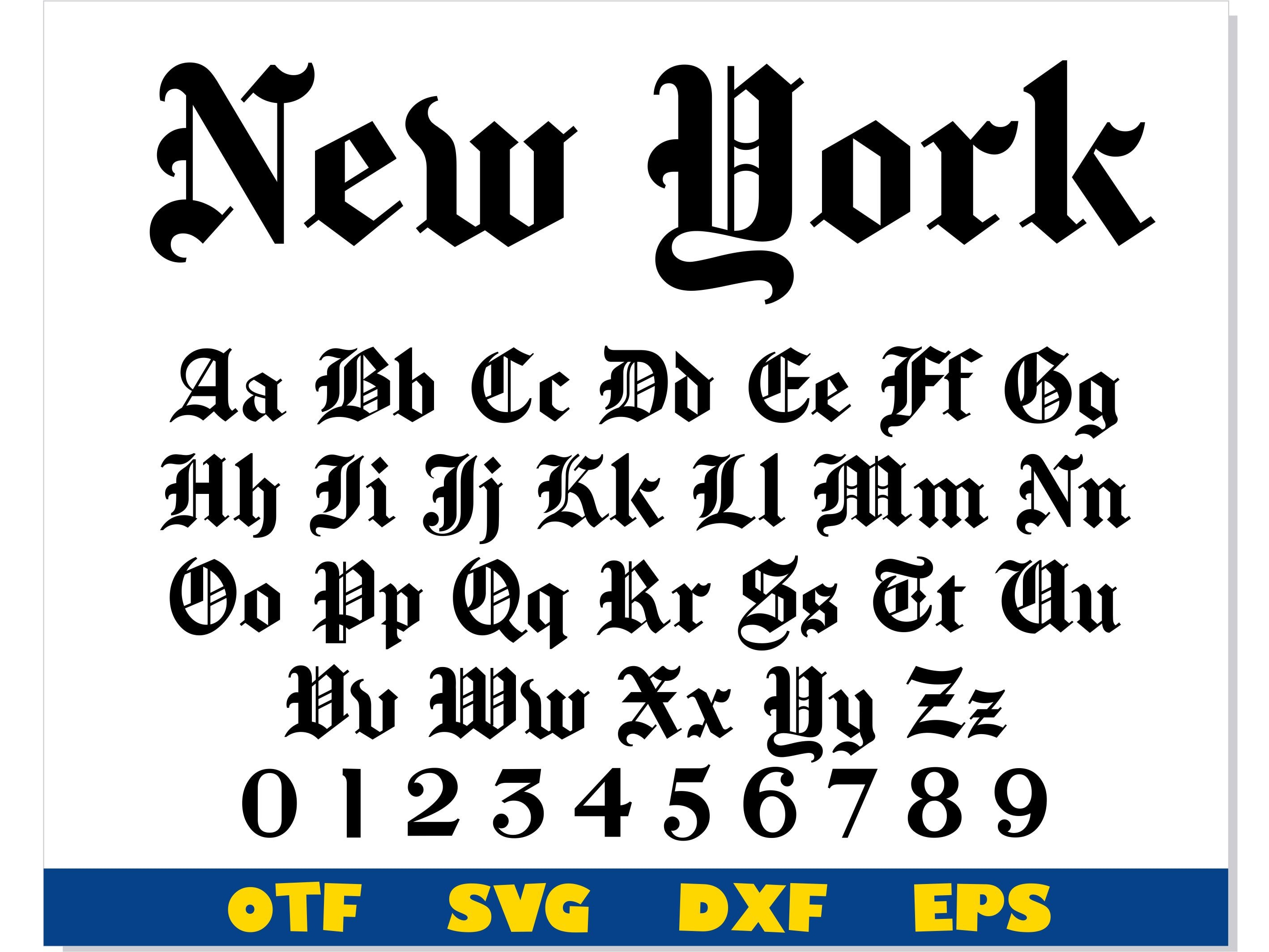
Building an editorial site requires more than picking fonts; it demands resilient font stacks that prevent Cumulative Layout Shift (CLS) and keep pages loading fast. Because proprietary typefaces are bound by strict licensing agreements, public web builds should construct a cascading fallback stack.
css
/ Editorial Headline Stack /
.editorial-headline {
font-family: "nyt-cheltenham", "Cheltenham", "Playfair Display", "Libre Baskerville", "Georgia", serif;
font-weight: 700;
line-height: 1.15;
letter-spacing: -0.015em;
text-rendering: optimizeLegibility;
}
/ Editorial Body Text Stack /
.editorial-body {
font-family: "nyt-imperial", "Imperial", "Georgia", "Source Serif 4", serif;
font-size: 1.125rem; / 18px /
line-height: 1.625;
color: #121212;
font-feature-settings: "kern" 1, "liga" 1;
}
/ Metadata, Captions, and Section Accents /
.editorial-meta {
font-family: "nyt-franklin", "Franklin Gothic", "Libre Franklin", -apple-system, BlinkMacSystemFont, "Segoe UI", sans-serif;
font-size: 0.8125rem; / 13px /
font-weight: 500;
text-transform: uppercase;
letter-spacing: 0.05em;
}
When implementing custom web fonts via `@font-face`, always serve WOFF2 files compressed via Brotli. Set `font-display: swap;` to maintain fast First Contentful Paint metrics on mid-range mobile devices, and declare exact `size-adjust`, `ascent-override`, and `descent-override` parameters on fallback fonts like Georgia. Matching the optical metrics of your local serif to the incoming web font removes the jarring layout jump that disorients readers as page assets load.
Sophia analyzes international trade, startup ecosystems, retail transformation, and supply chain logistics for modern digital publications.
