From Hot Metal to Pixel Perfection: the Evolution and Modern Redesigns of Nyt Typography
 By Elena Rostova
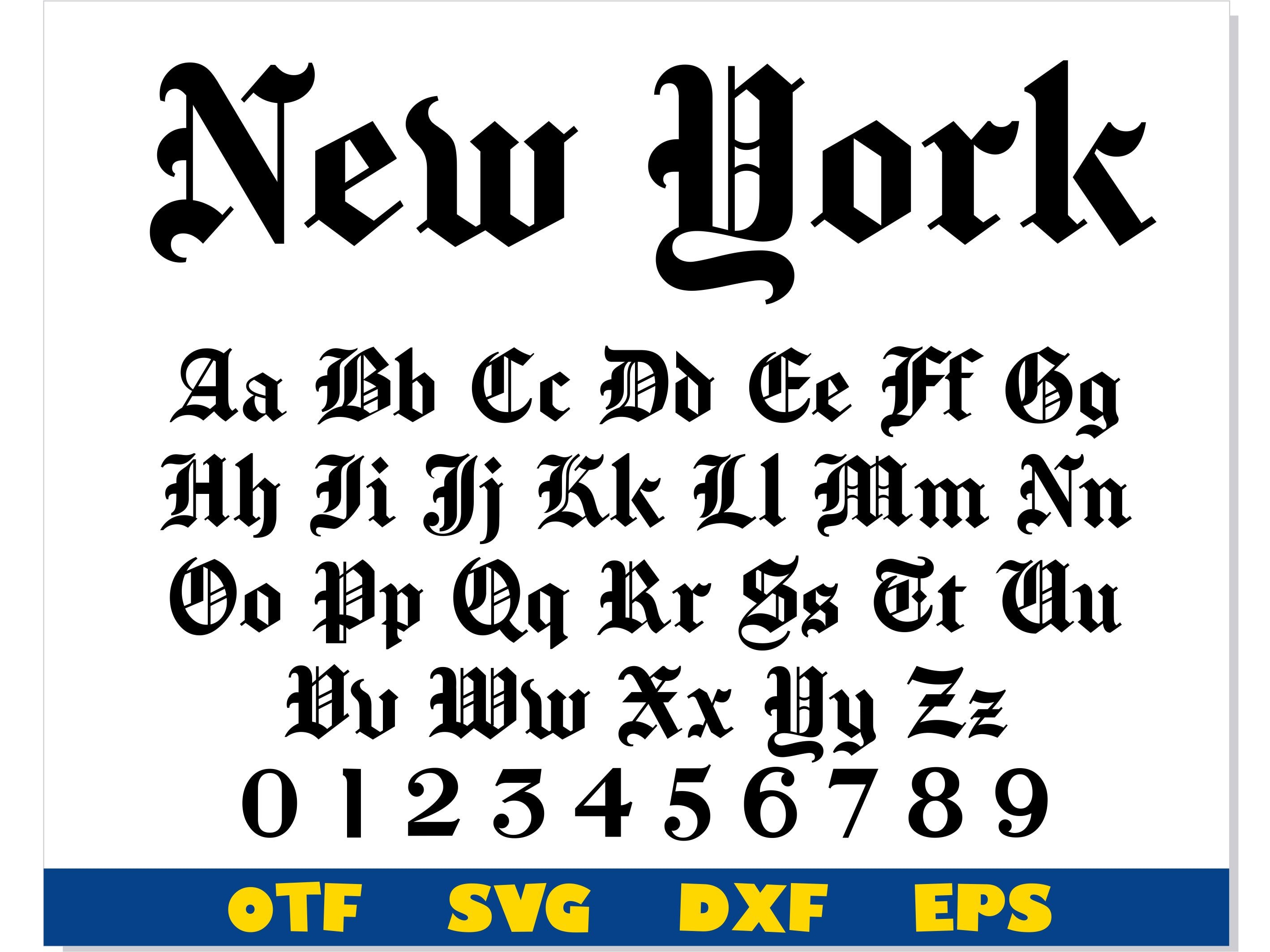
The iconic blackletter masthead at the top of page one is not a font at all. It is a locked piece of drawn lettering rooted in nineteenth-century German Fraktur and English Text traditions.
Publishers in the 1850s adopted heavy gothic letterforms because they projected moral seriousness, scholarly authority, and religious solemnity. While competitor broadsheets gradually shifted toward cleaner neoclassical or geometric serifs, the Times stood firm. The modern mark is an exact, vector-preserved iteration of a 1967 refinement drawn by legendary book designer and typographer Edward Benguiat.
Benguiat made several microscopic adjustments that most readers never detected. He eliminated a clumsy ornamental drop-shadow inside the letter flourishes, shaved the hairline terminals to prevent ink buildup between the letters "N" and "e", and redrew the period at the end of the phrase. When the paper dropped the closing period from its masthead on February 21, 1967, readers mailed in thousands of letters protesting the missing dot. The controversy proved that a nameplate acts as a legal seal of authenticity rather than simple decoration.
Elena Rostova holds a Master's degree in Public Health Journalism. She covers groundbreaking medical research, holistic wellness trends, mental health awareness, and nutritional science.
